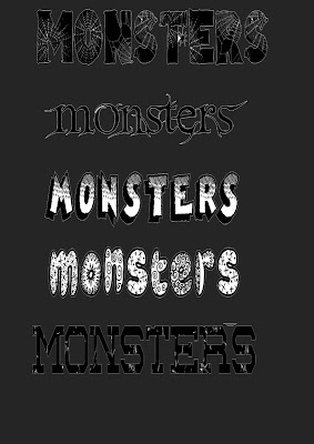
5 different fonts:
In our groups we had to go on dafont.com and choose 5 fonts for the name of our advert that we think would fit well with the theme of our advert.
http://www.dafont.com/
I like the first one because it gives our advert a scary and creepy theme as it has spider webs on it and the text is black and bold.
The second one looks less scary but still creepy and mysterious which could also go well with our product.
This is the best one for our brand because the writing is bold and looks like a comic which I quite like. It is also freaky and it pops out and stands out .
This one is bold but looks friendly and bubbly which will not fit well with our advert. But whats good about this is the patterns on it and when the colour if the colour of it is changed, it will look more scary.
I quite like this one as well because it makes the our product look strong and the writing is spaced out quite well.
We went on the website and print screened the texts that we liked and then pasted them on to photoshop.Then we used the rectangular marquee tool to cut out the text to get rid of the things we do not need.
These are the two different fonts I made all by myself that I thought would look good for our chocolate bar. I used the rectangular marquee tool to cut out the thing I don't need when I print screened the image.
I like this first one because it is bold and when you read it it sounds like you are shouting which would make our product look scary and strong.
The second one is bold and simple, without anything fancy on it which is why I like it.
Then I changed the colour of the label by double pressing on the layer and going on colour over lay. Then I also changed the pattern on it to have little faded black dot on it to give it a freaky look. Also I added a black shadow around it to make it look bolder.

At the end we had to create our final package for
our chocolate and this is what we are going to use for our chocolate bar-
The nutrition information, the bar code, and the ingredients were copied and pasted to make the package look realistic.
Different tools were used to create this such as text box to create the text and pen tool to crop around the monsters.


No comments:
Post a Comment